Want more mods for That's not my Neighbor? Explore our entire collection!
Accessibility
"Colours you can tell apart. Dialogue you can read."
How do I install Accessibility?
Download the free ProjectMods desktop app, then install Accessibility for That's not my Neighbor in one click.
</>What does Accessibility do?
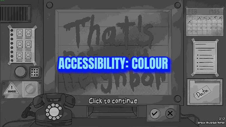
The whole job is comparing a face at the window with an ID, an entry request and today's list. If certain colours blur together for you, or the dialogue is too small to read comfortably, that job gets harder than it should be. Accessibility hands you a colour filter, a contrast slider and bigger dialogue text. Colour Filter shifts the colours of the whole picture so the ones you mix up stand further apart. Choose Red-Green (Green-Weak), Red-Green (Red-Weak), Blue-Yellow or Greyscale, then use Filter Strength (0 to 100, starts at 100) to decide how much of the shift you get. High Contrast (0 to 100, starts at 0) pushes light and dark apart and strengthens colours, with or without a filter. Text Size (100 to 200, starts at 100) makes the dialogue text bigger. Set Colour Filter to Off, High Contrast to 0 and Text Size to 100, or switch the mod off, and the game's own picture and text size are back at once. No game setting and no save file is changed.
</>What is Accessibility?
Accessibility changes how That's not my Neighbor looks, not how it plays. Colour Filter offers Red-Green (Green-Weak), Red-Green (Red-Weak), Blue-Yellow and Greyscale, and Filter Strength sets how far the colours move. High Contrast separates light from dark, and Text Size enlarges dialogue up to 200. Text on IDs, entry requests and menus stays the same size. It is not a zoom, and it never touches the game's own settings or your save.
</>Common questions about Accessibility
What does Accessibility do in That's not my Neighbor?
It changes the picture and the dialogue text so they're easier to see: a colour filter, a contrast boost and larger dialogue lines. Each of the three works on its own, so you can use only the one you need. The filters help you tell colours apart. They don't restore colour vision.
Why is one line of dialogue bigger than the next?
Because every line is sized on its own to fit the text box. The game's dialogue text is size 35, or 37 in Nightmare Mode, and Text Size 200 allows up to 70, or 74 in Nightmare Mode. A short line can reach that. A long line that already fills the box stays at the game's size, so two lines in a row can differ.
Does Text Size make the writing on IDs and entry requests bigger?
No. Text Size only changes the dialogue text box, which visitors, the phone, endings and the tutorial all use. Writing on IDs, entry requests, today's list and in menus is untouched, and the mod has no zoom or magnifier. Colour Filter and High Contrast do reach those documents.
Does it change the game's own accessibility settings?
No. Captions for sounds, Color labels, Trypophobia censor and Hide flashing lights belong to the game and stay exactly as you set them. This mod doesn't switch them on or off, and it doesn't remove flashing or scary images. Its filter sits on top of whatever the game is showing.
Why can't I see any change after picking a filter?
Check Filter Strength first: at 0 a chosen filter changes nothing. If your graphics driver can't run the filter at all, a message says so and the picture is left the way the game draws it. When it runs, the filter covers everything the game draws, menus and loading screens included. Only the mouse pointer and ProjectMods' own messages keep their colours.
What options does Accessibility include?
Filter Strength
How far the Colour Filter shifts colours, from 0 (no change) to 100 (the full shift). Lower it if colours look too strong. Default 100.
Text Size
Makes the dialogue text bigger, from 100 (the game's own size) to 200 (twice as big). Each line is shown as large as still fits in the text box, so short lines grow the most and nothing is cut off. Text on documents and in menus keeps its size. Default 100.
Colour Filter
Shifts the colours of the whole picture so the ones you mix up stand further apart: the window, your desk, IDs, entry requests and the menus. Pick the kind of colour vision you have: Red-Green (Green-Weak) is the most common, Red-Green (Red-Weak) makes reds look dark, Blue-Yellow is for mixing up blue with green, or yellow with pink. Greyscale removes colour entirely. Off leaves the game's colours as they are. Default: Off.
High Contrast
Makes light and dark parts of the whole picture stand further apart and colours stronger, so small differences in a face or on a document are easier to spot. 0 is the game's normal look, 100 is the strongest. Default 0.
Accessibility is a ProjectMods mod for That's not my Neighbor that puts one of four colour filters and a contrast boost over everything on screen and enlarges the dialogue text up to 200 percent, while text on documents and in menus keeps its size.
System Requirements
What features does Accessibility include?
- Colour Filter has four choices besides Off: three for different kinds of colour vision, and Greyscale, which removes colour entirely.
- Filter Strength applies as much of the filter as you want, from 0 (no change) to 100 (the full shift) in steps of 5.
- High Contrast at 100 gives 1.4 times the contrast and 1.3 times the colour strength of the normal picture.
- Text Size shows each dialogue line at the largest size that still fits the text box, so short lines grow the most and nothing is cut off.
Best For
- Reds and greens on an ID look alike to you. Set Colour Filter to Red-Green (Green-Weak), or to Red-Green (Red-Weak) if reds also look dark, and leave Filter Strength at 100.
- You mix up blue with green, or yellow with pink, so set Colour Filter to Blue-Yellow.
- A filter helps but the colours now look too strong. Lower Filter Strength to 50 or 60 for a milder shift.
- Faces at the window look flat on your screen. Raise High Contrast to 50 with Colour Filter left on Off, and go higher if you want more.
- You sit a long way from the screen and the visitors' lines are hard to read. Set Text Size to 150 or 200.
More Mods for That's not my Neighbor
Achievement Unlocker
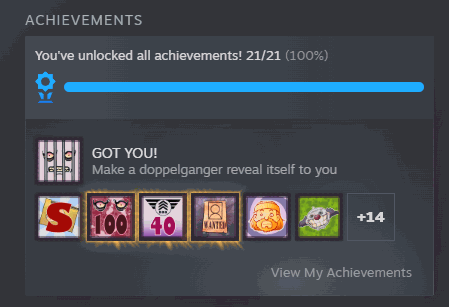
Unlock any one of the game's 21 achievements or all of them together, in the Achievements folder and on Steam, with the game's own trophy pop-up. One button locks all 21 again.
Doppelganger Count
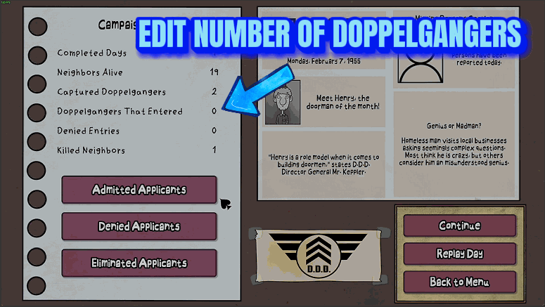
Sets how many doppelgangers arrive in each day's queue, from 0 to 12, and lets you send the day's wanted doppelganger away.
Unlock All Game Modes
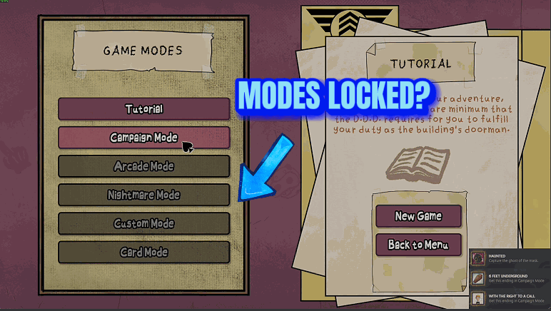
Open the five locked modes on the Game Modes screen, from Campaign Mode to Card Mode, all at once or one lock at a time. The game saves the unlock, so the modes stay open.